


Michigan Medicine Digital Signage
Digital signage is used throughout the health system for announcements, events, and online newsletter stories to read. The integration of type and symbol is the basis of logo design and effective typography. Illustrations by Karen Parker Moeller
In order of appearance:
- Arrows represent downward trends and the umbrella represents “protection”—the message is about averting risk.
- A literal interpretation of “parking on top of one another” is a whimsical graphic about a frustrating circumstance.
- Asking employees to submit what they are thankful for around the holiday.
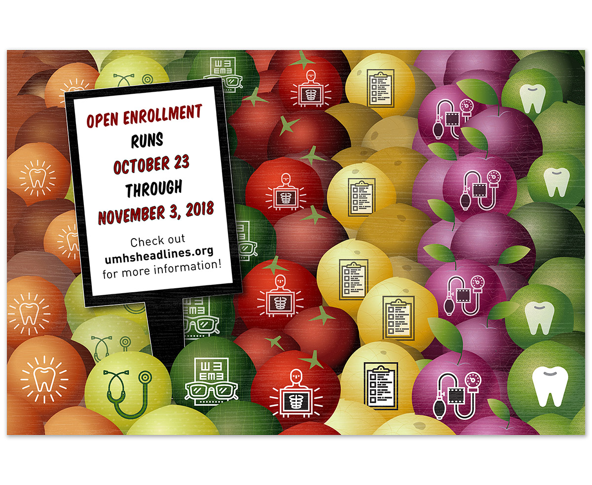
- Health insurance open enrollment provide many options to choose from like produce in the grocery store.
- The “Old Hollywood” themed event is expressed using a theater marquee type treatment.
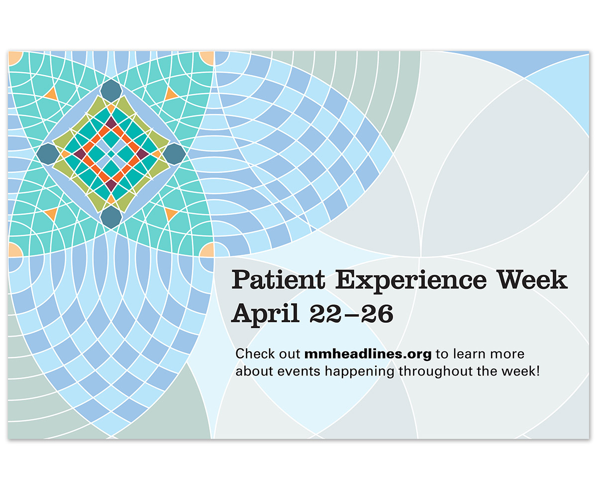
- The Office of Patient Experience “branding” always includes a complex circular grid treatment.
- A colorful “RESPECT” overlays a photo collage of employees. Both the image and words communicate diversity, respect and acceptance.
- The symbol of a rewind arrow is embedded within the type to enhance the message.